
Project Overview
Master Data Management was a PowerBI an application that handled all of the data for the interfaces that allowed for users to plan the Financial Data for the entire group. Due to the amount of data being updated and added, the application was becoming unwieldy and hard to manage, so I was brought onto the team to assist in redesigning the application to be implemented on the SAP platform. The team wanted to streamline the creation and update process to make it easier for users while keeping those processes similar and clear for the veteran users. We were also using this opportunity to bring the application in line with the Corporate Design system, as the previous platform was very rigid in its styling. I worked closely with an SAP development contractors as well as the internal product team to make sure we were successful.
Project Details
Date: 4/2024 – 11/2024
Employer: Turnberry Solutions
Role: Lead UX Designer
Client Sector: Pharma Fintech
Software Platform: SAP
Skills Utilized
- User Research/Testing
- Digital White Boarding
- Research Synthesis
- Rapid/Interactive Prototyping (Figma)
- Design System Utilization
- ADA Compliance Validation
- Collaboration with Development Teams
- Mentoring a Junior Designer
Project Process
Discovery
1:1 Remote User Interviews
Research Synthesis
Platform Research
Design
Interactive Prototypes
Team Design Reviews
Design Mentorship
User Testing
1:1 Remote User Testing
A/B Testing
Iterative Design Practices
Phase 01 – Discovery
Getting Started
I was brought onto this project a bit late in the process, so I had to do a bit of catch up in the Discovery Phase. Another development consulting firm was brought in to do the bulk of the work and I was there to give UX feedback and help implement the solutions. The consulting firm also had a junior designer on the project, so I was fortunate to be able to mentor her and it allowed us to really show off that pushing user-centric design would make this application really shine.
Problem Statement
The Master Data team was using a PowerBI application to manage all of the data input and change requests that came in from across the Financial organization of our client. PowerBI was not up to the task of handling all of these requests, so the consulting firm that was brought on to develop this solution had sold our client on using the SAP system. This was also in part to synergize with other applications being built on that platform across the organization. Our main concern was transferring the existing functionality to the SAP system while also attempting to streamline as much as the processes as possible while we did so. Due to tight timelines and budgets, we could only address so many of the issues that we would come across, but we were determined to make the best MVP product that we could.
Note: Whenever I run into instances where there is only so much bandwidth for reworking a particular feature or process, I will still solution and design them in order to be put into the backlog for future engagements. We’re already doing the work up to that point and the amount of effort is usually minimal, so giving as much extra value for my clients has always been very important to me.
1:1 User Interviews
Before I was brought onto the project officially, I worked with the UX Manager for Finance at the client to conduct user interviews based on the current PowerBI solution. I facilitated 2 of the 8 interviews and afterwards the data was synthesized and sent to the team. This was my framework for moving forward with the Product Team to steer the project in the right direction.
User Feedback
- Users enjoyed the current Request Creation Process as a whole.
- Users wanted to have some of the language and prompts more clear and understandable.
- Users did not like the branching paths of general and expert request creation.
- Users disliked how slow the system was overall.
- Users wanted to be able to upload larger requests using Excel templates.
The product team was actually quite surprised by some of this feedback and it caused us to reassess some of the requirements that were already gathered. We met with the SMEs (subject matter experts) and the business team to verify our findings and they agreed and we all aligned on the direction that we would take.
Phase 02 – Design
The Design Phase Plan
The UX Team would schedule twice a week sessions with the Product Team to coordinate the features that we would work on while they would start building the back-end of the application. We scheduled Sprints with the express purpose of making sure the UX Team was several steps ahead of development to make sure there was no work stoppage. Once the Product Team signed off on the designs, we would meet with the SMEs and Business Leads to validate the work that was done. The initial plan was to get a list of users to engage is 1:1 User Testing as each feature was approved in order for us to make any adjustments before the development team started on a particular feature. Unfortunately, due to tight timelines and other issues, we were not able to conduct user testing for these features. Luckily, we had our initial user feedback in the Discovery Phase to help guide us.
Note: Due to the amount of processes in this application, I will not be digging into every single one of them. I will address the main workflow that is most often used by the users and go into detail about how we went about streamlining it and the processes associated with it, but this will not be an exhaustive study of the entire application. (Not sure who has the time to read all of that anyway!)
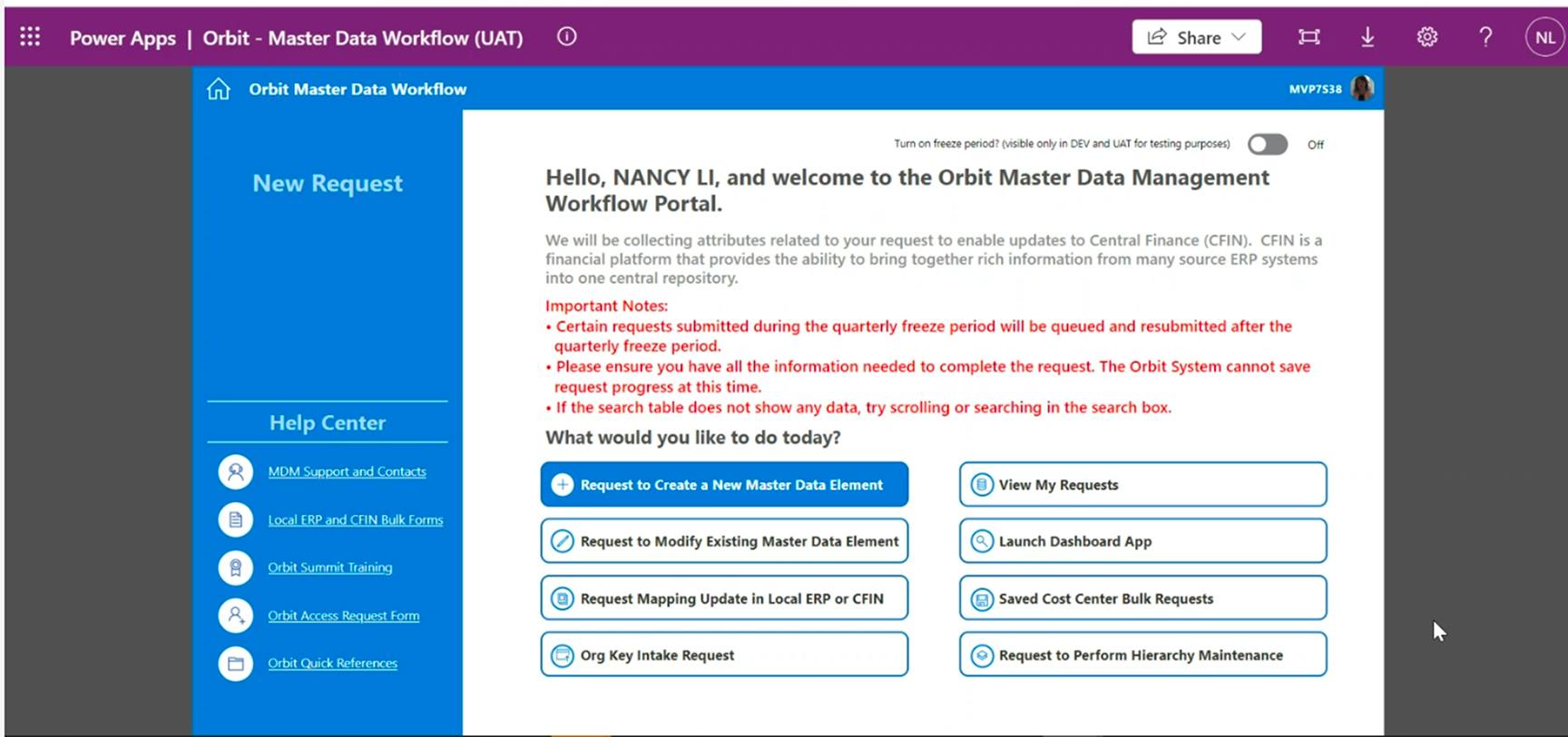
01 – Landing Page
The MDM landing page was our first major feature and it was the hub of all of the activity for the future of the application. The original landing page concept was rather simple and did not utilize all of the space available in a constructive way. There was also the issue of it not matching the Corporate Design System that the client was urging to be adopted across all of their applications.
There were some features that we really focused in on for this phase of the project:
- Preserve the “guided” experience for the users to create requests.
- Allow the users to track their requests on the landing page itself.
- User the Design System’s built in alert system to educate users on any notices instead of in the middle of the work space.
- Create a space for some of the admin applications to be present on the landing page for the power users.
- Group up the Help articles and put them into their own menu to clear up more space.
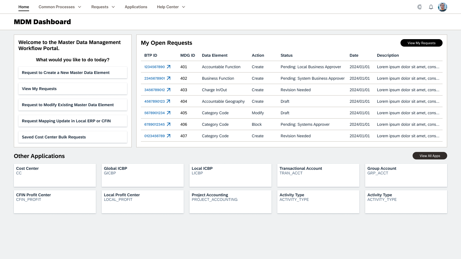
We tightened up the initial list of Request prompts and really focused on what the day to work would be for the users. If the users wanted to dig into something more complex or something accessed very infrequently, they could browse the View All Apps page and filter down to the application they needed. The SMEs were thrilled about this as they were forced to find the applications that were not present on the old landing page using workarounds.
Having access to the user’s Open Requests on the landing page really opened up an avenue for a much quicker and streamlined workflow for the average user. In the old solution, the user would have the click on View My Requests and filter through a large table in order to find what they were looking for. There was still a need to search in a great pool of requests, but we relegated that to its own navigation item of Requests, which would open a table with a much better filtering system which we will address later.
02 – Create New Master Data Element
Major Pain Points
This was where we spent the majority of our time on this project as it was the main branching path to the creation of the requests that users would interact with.
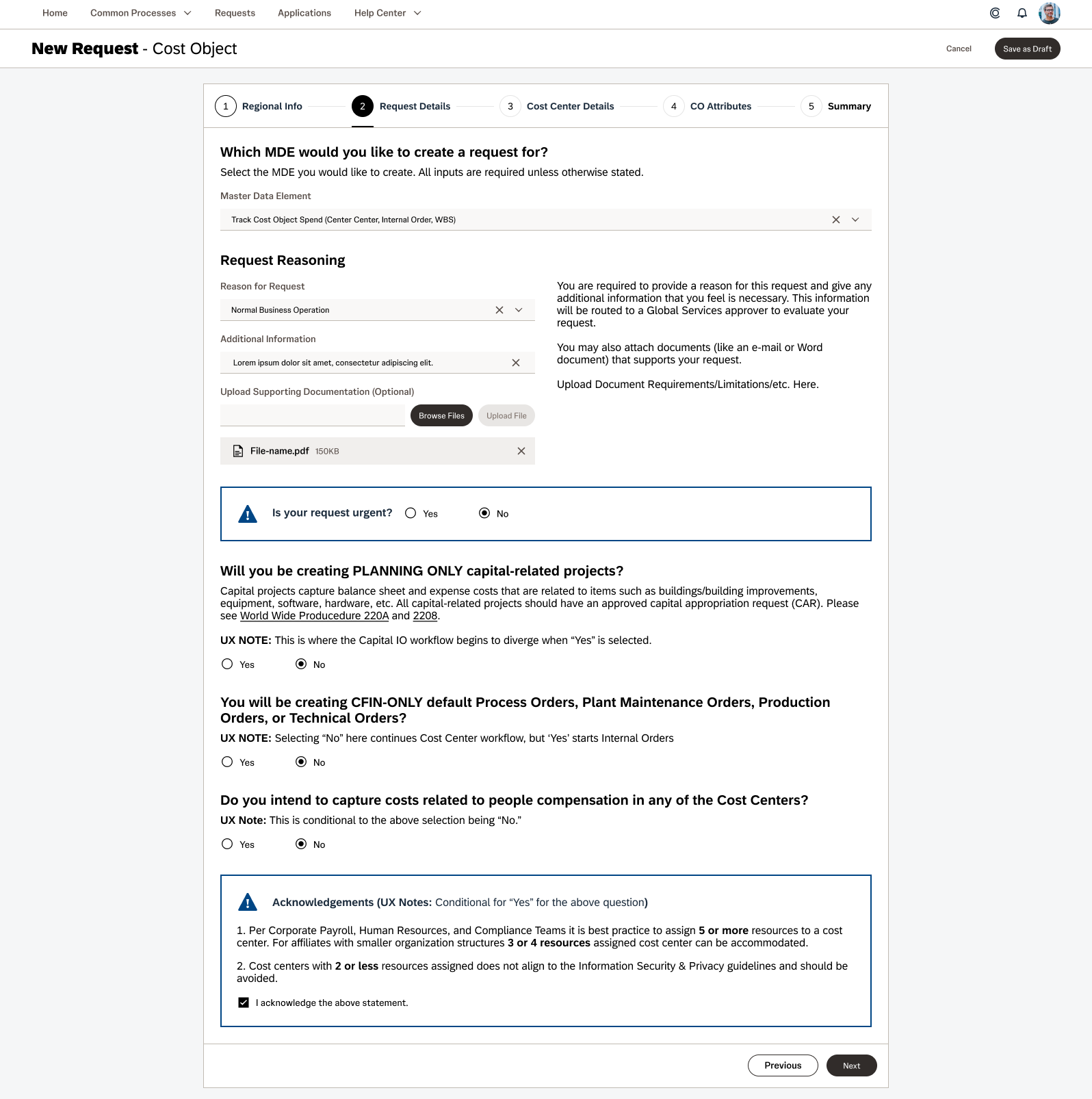
General Creation Process
The process of creating these master data elements were a maze of pages with no real navigation. The selections you made during this process would take you down different paths with very little indication of which path that event was. There was no indication of how many steps there were in each of the processes which caused a lot of stress for users who were not familiar with the amount of data that was expected to be entered.
- Unclear path to creating a data element
- Unknown number of steps the particular path would lead the user
- No indication to guide the user to a particular goal

Data Table Inputs
Users had to input data into confusing tables with unclear labeling and a multi-page navigation instead of scrolling horizontally. Users would input their data on one screen, click a button to validate the data, and then click next to go to the next set of data cells.
- Complicated form fields with confusing labeling
- No horizontal scrolling
- Unclear instructions and hover states
- No cell tabbing functionality
- Manual data validations
- Data validations in the headers, not on the specific cells
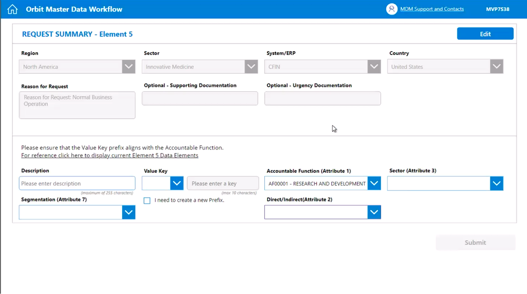
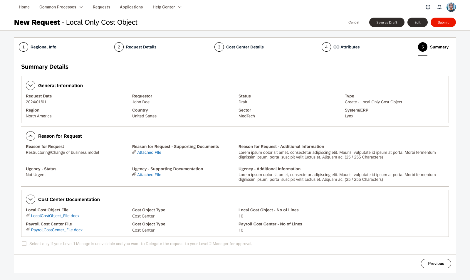
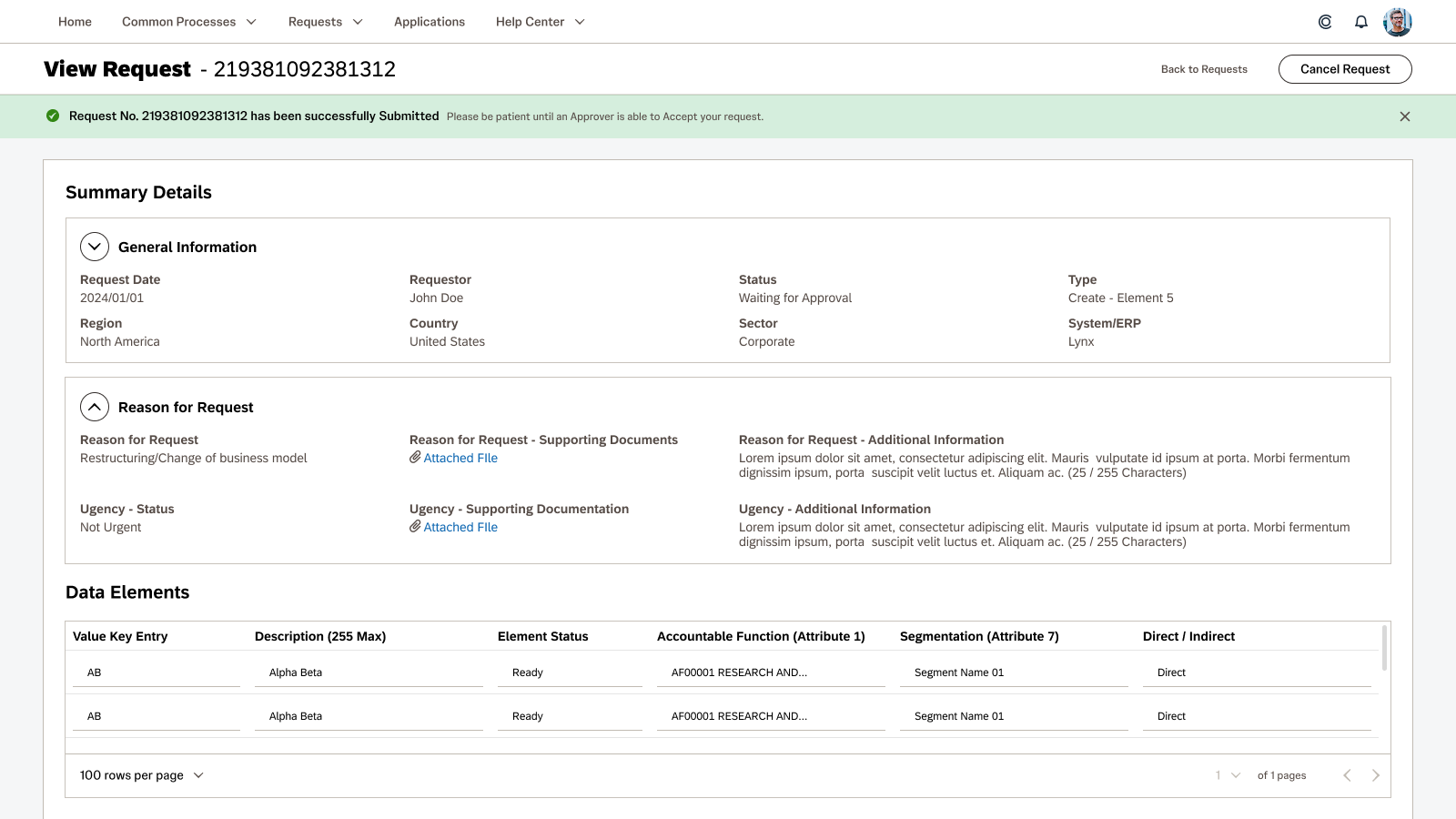
Summary Screen
When you finished making all of your selections and inputting all of your manual data, the user would be sent to a summary screen where everything they had selected is displayed for them.
- Unclear labeling of the intention of the summary screen
- Allowing for edits to be made on the summary screen instead of being navigated to the editing step in the process
- Using disabled form fields instead of displaying the clean data to make reading easier
The Proposed Solution
We did not have a lot of flexibility to change the process as much as we would’ve liked, but we were able to implement several features to make this process more clear and organized.
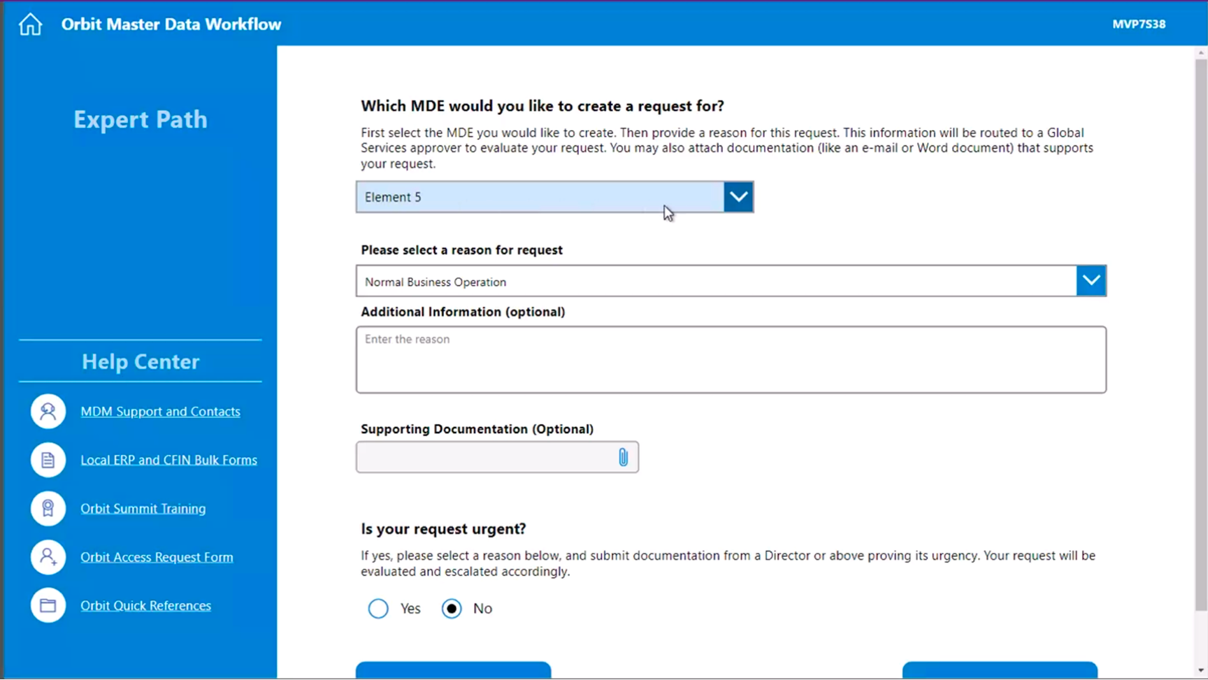
General Creation Process
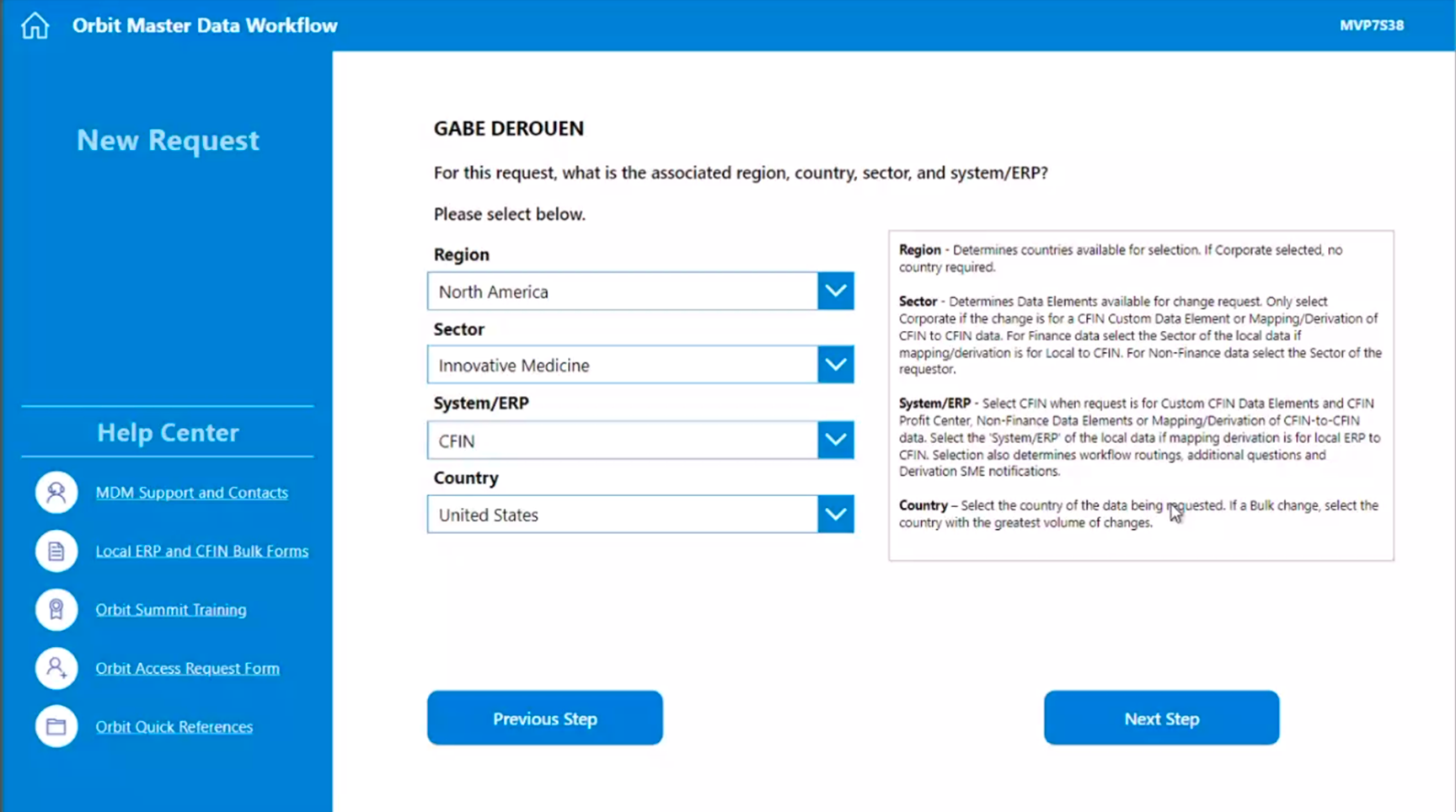
Instead of having 10+ pages per process, we opted to break each process into a 4-5 step process with conditional drop down selectors for each of the steps that would help guide the user towards the particular request. Once you are set on a particular path, the page would have a clear messaging saying exactly which process you were engaged with to avoid confusion.
- Large and visible title bar with indication of which master data element the user has started creating.
- Global navigation items that pertain the process as a whole that are present throughout the workflow. (Save as Draft, Cancel, Submit, etc.)
- Step-by-step process bar at the top of the content block to show where the user is in the process.
- Sub navigation buttons that are consistently at the bottom to allow the user to go forward and backward in the process.
- Grouped inputs together based on the context of the master data element to help users understand the process.
- Descriptive language to help uses navigate towards their intended goals.
Note: The “UX Notes” in the mock ups are for the business team to write up prompts for the pathway to be clearer for the users. I had to put those notes there for myself and the other designer on the project because of how confusing the processes would become.
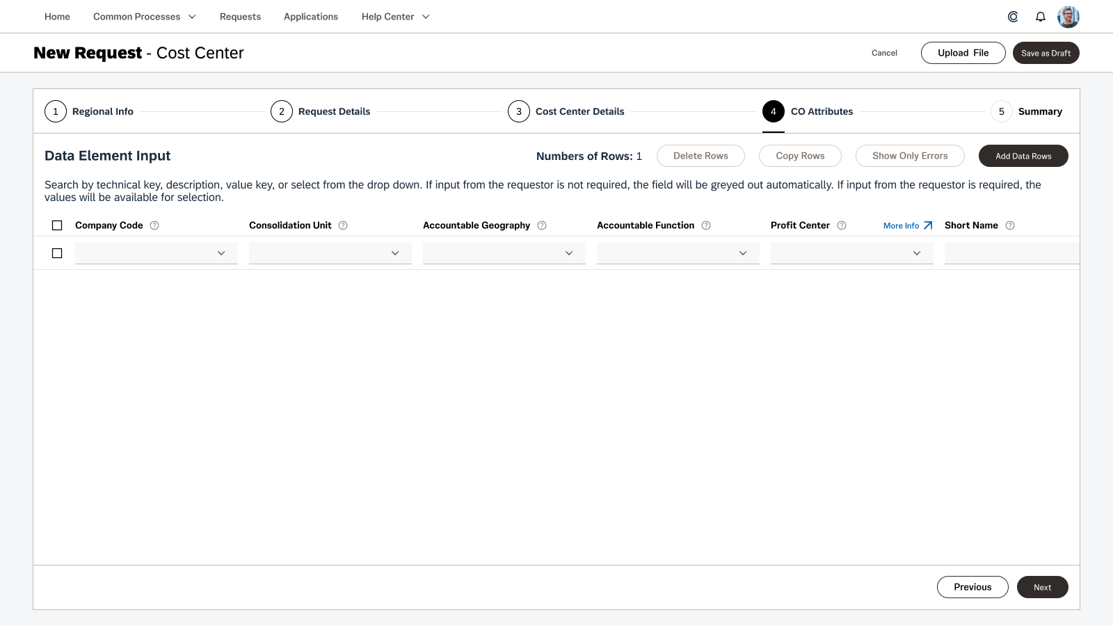
Data Table Inputs
We attempted to guide the team towards a solution that would not require horizontal scrolling, but they wanted as close to an Excel experience as possible due to the fact that some of their users would mass paste their data into these tables.
- Merged Upload process and Manual Data Input process into a single screen.
- Moved the validation indicators into the table cells for clearer location of errors.
- Added an option to only see the validation errors to make corrections easier to address.
- Enabled horizontal scrolling with sticky cells for easier data inputs.
- Cleaned up table headers and form text to be easier for users to read and understand their usages.
- Allowed for links to be posted in headers if extra documentation is required. (Suggested to be used sparingly)
Summary Screen
We pushed for a cleaner and more readable version of a summary screen where the users could review their data with ease. This format will also mirror the Request Details screen so that users will be able to make a visual connection between the two.
- Data clearly grouped into labeled sections based on the data contained
- Ability to collapse sections for easy hide/show actions to check the data for each section easily
- Data points laid out evenly across each section for ease of review
- Ability to return to edit the data that will take the user back to the previous step of the creation process
- Submit button clearly at the top in the global navigation so the user doesn’t need to scroll to the bottom to find it
03 – Request Details and Approvals
The full details of requests for MDM were only able to be seen in terminal style database views. We team wanted the users to be able to see and review the data in a more user friendly format that allowed for a robust review process across multiple users. The requirements were as follows:
- Requestor needs to be able to submit a request to Create / Edit a Master Data Element
- Reviewer needs to be able to review a request and flag certain data rows for revision and be able leave notes for the Requestor.
- Requestor needs to be able to edit the request to correct the errors flagged by the Reviewer.
- Reviewer needs to be able to review the corrected request and flag it as reviewed.
- Data Stewards need to be able to approve or reject requests and be able to leave notes for the Requestor.


The Product Team originally wanted to flag the entire request for revision and rely on manual note inputs by the Reviewer, but during the initial design discussion, the UX Team suggested that the development team look into the feasibility of flagging the specific row in the request instead. The groups went back and forth about the complexity associated with this request and eventually landed on a solution that was workable.
When the Reviewer goes into the review screen, they are shown check boxes at the beginning of each row for them to flag as a revision. When a row is checked, the Request Revision button is made active and when it is clicked a modal pops requesting the Reviewer to give their reasoning for the revision request. Once that reasoning is filled out and the confirmation button clicked, the Reviewer is brought back to the request screen with an alert banner informing them that the request has been sent.
The Requestor is then informed that they need to revise their request before going forward.
Phase 03 – User Testing and Beyond
The Future of MDM
As projects progress and budgets shift at the end of the year, the future of a designer’s place on a project gets put into question. Unfortunately, the budget did not allow for my continued participation in the MDM project, but luckily, the Junior Designer that I had been mentoring and working shoulder to shoulder with every day was allowed to stay. She was employed by the same consulting agency that the development team was from and they were all a package deal. I was proud to hand the reigns over to her and knew she would continue the work that we had started together.