
Project Overview
Inventory Event Management is a system where business analysts would create events in order to supplement the inventory of stores based on holidays or other occasions that were not part of the forecasting process. This system consisted of multiple processes that required the uploading of unvalidated local Excel files and a confusing search interface that the users had several issues interacting with. The Enterprise UX Team assigned me to the project to help the Product Owner and development team streamline this process. We conducted several UX processes including user testing, research synthesis, and design studios in order to dig into the issues and make sure we delivered the best product we could for the users.
Project Details
Date: 07/08/2016 – 04/01/2017
Role: Lead UX Designer
Skills Utilized
- User Research
- 1:1 User Interviews
- A/B Testing
- Research Synthesis
- Design Studio
- Rapid Prototyping (Sketch)
- Interactive Prototyping (Axure)
- Lead Scrum Ceremonies
- Design System Utilization
- ADA Compliance Validation
Process
Discovery
Team Kick Off
1:1 User Interviews
Research Synthesis
Design
Design Studio
Team Design Review
Interactive Prototypes
User Testing
1:1 User Testing
A/B Testing
Research Synthesis
Build & Iterate
Pair Programming with Devs
Post Production User Validations
Analytics / Surveys
Phase 01 – Discovery
Problem Statement
During the Kick Off, the team met with the Product Owners and discussed their list of expectations and needs. There were two major hurdles that needed to be addressed during this project:
- Users searching and sorting events to review the data quickly
- Business Analysts creating events within the app without uploading Excel files
The original search parameters that the users were forced to use were very complicated and confusing for the users. It was built with the mindset of a developer and not as a user. Lots of “and” and “or” selections which most of the user base was not comfortable using.
For the creation process, Business Analysts had to export and import spreadsheets from different applications in order to build events. This process was tedious and confusing and it caused a lot of issues with data being accurate depending on which system was being used. The long term goal was for users to be able to transfer data across multiple platforms to improve inter-connectivity, but that was outside of the scope of this project.
1:1 User Interviews
After discussing which features we would address first, I wrote a script in order to gain more data from the users themselves. It is important to make sure not to ask leading questions in order to get non-biased feedback from the users. After the script was approved, I interviewed the users while they used the current tool and recorded their reactions and answers to my questions. The videos of these sessions was them edited and put into a easily digestible format for research synthesis sessions.
Research Synthesis
Research Synthesis is a multi step process in order to nail down the paint points of the user and the business in order to prioritize them for future features and enhancements.
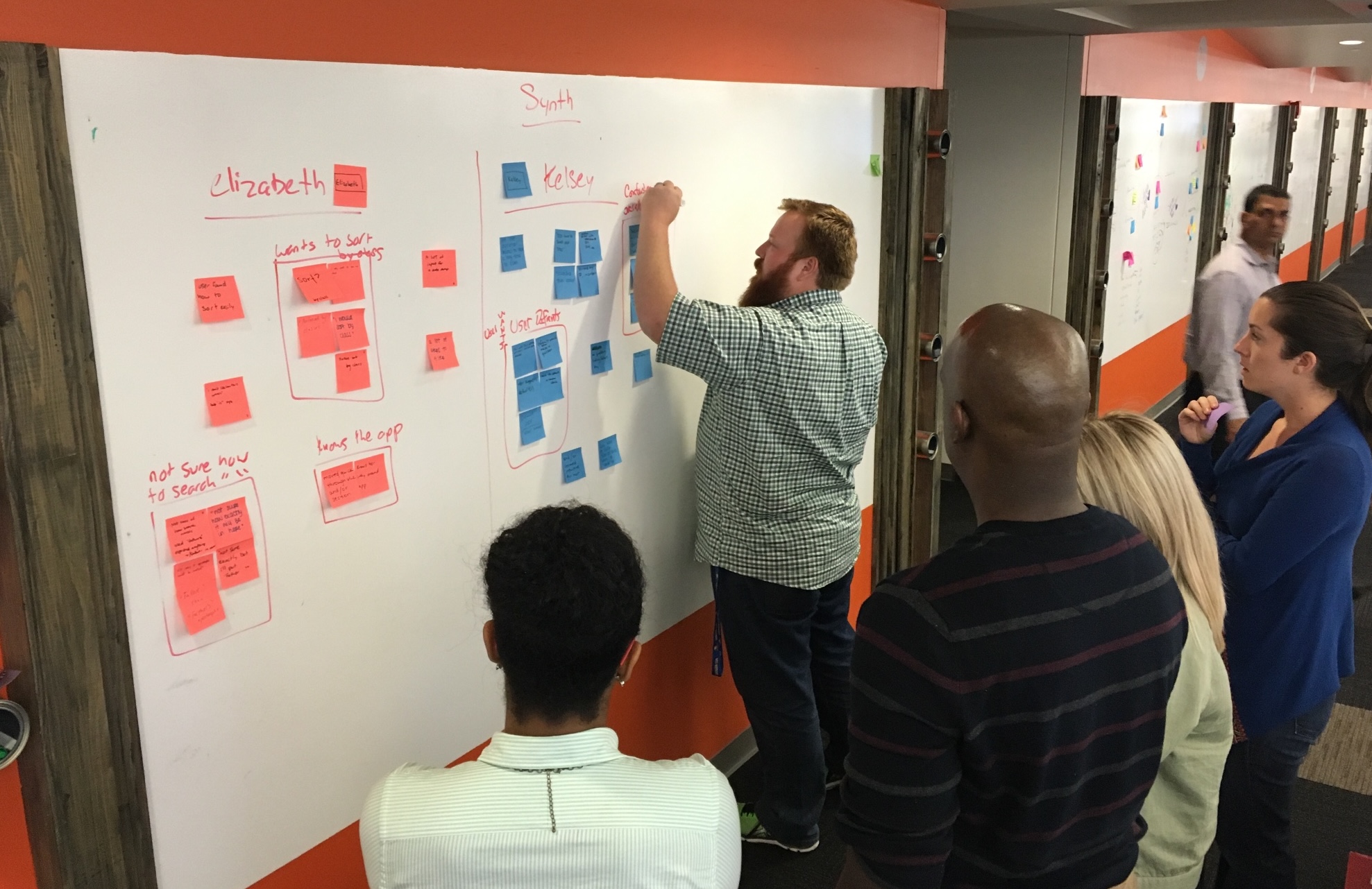
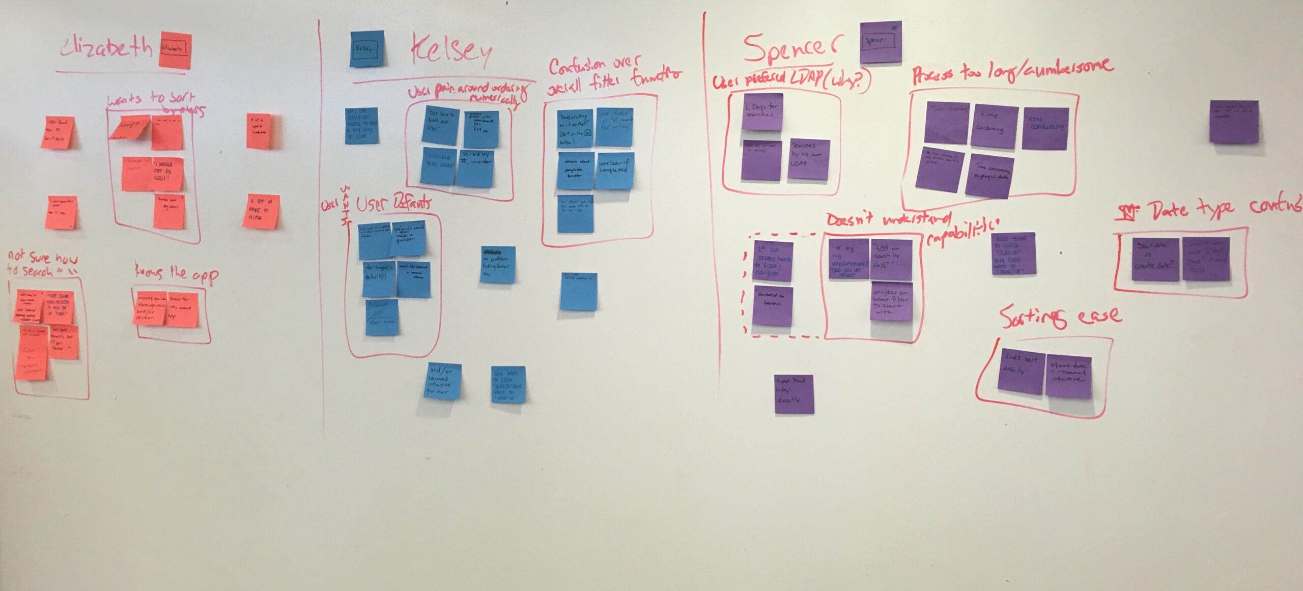
- Phase 1 – The video was played of a specific user interacting with the application. We then wrote on sticky notes as we watched and listened to the comments and actions being shown.
- Phase 2 – We then rinced and repeated for each of the different users using different colored sticky notes to represent them.
- Phase 3 – After all of the sticky notes were written up, we grouped all of the overlap in issues seen across multiple users so that a heat map was shown of common issues and wrote them up on the white board.
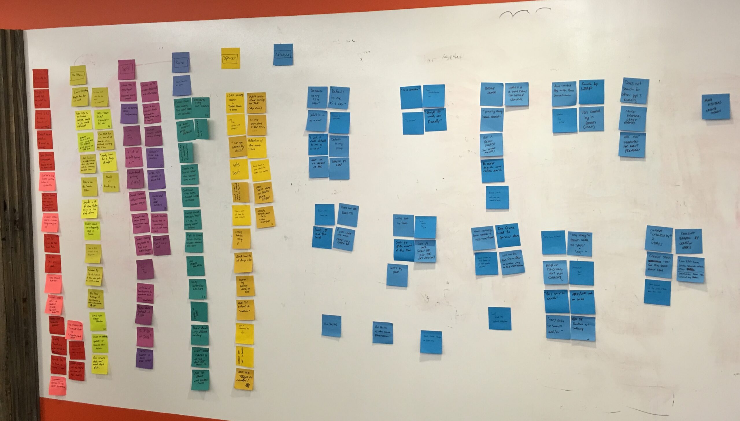
- Phase 4 – The list of issues was then placed on a User Pain vs. Business pain matrix in order to prioritize the issues.
Prioritization of Features / Issues
After the session, the list of issues were as follows:
- The users are not familiar with other search filters and criteria within IEM
- They want IEM to default to a particular analysts’ needs
- Shared classes are difficult to manager between multiple analysts
- The users didn’t know how to search for “Black Friday” items
- Cannot switch between the “AND” and “OR” functions or already selected search conditions
- LDAP filter not as helpful because of the MCT events
- Date search functionality is cumbersome and confusing to use. It’s easier to sort by date in the data table.
- Confusion with “Date Created” vs. “Date Started”
- The users have to click too many times before the search has been activated.
- Couldn’t search by “Users 1” or “User 2”
Phase 02 – Design


The Proposed Solution
We ended up creating a much more streamlined search experience that simplified the process as well as followed design patterns that most users would be familiar with. We designed two different layouts that had it’s Pros and Cons. We would eventually test both of these solutions with users to see which they preferred.
Left Hand Side Vertical Search
This search was a left handed filtering system similar to some eCommerce solutions that users would use in their daily lives. It features collapsible sections in order to hide items that the user didn’t need to see all of the time and allowed for easy expansion as data sets would be added.
The main concerns with this solution were that the amount of data points that were proposed and suggested were a bit overwhelming to the users. Which this solution might be a good place to expand to in the future, it wasn’t a good initial step and required much more development time when our timeline wasn’t very robust.
Horizontal Search Bar
This search was what you see in the final screens shown on this page. We had the most used filtered across the top of the application so the users could easily access the data points that were most important to them. This also avoided cannibalizing the horizontal space the table needed to display as much data as possible for the user without forcing them to scroll horizontally.
We also implemented a “Show My Events” button to allow the users to quickly find only their items to make their queries even faster.


Feature Improvements
- Alignment with THD Design System
- Muli-select drop down menus
- Dismissable selection indicators
- “Show My Events” toggle
- Robust Date Selection tool
- Expandable rows to see more details
Benefit Analysis
- Customer Impact – The customers are able to purchase items that are popular during peak seasons with ease and not need to worry about them being sold out.
- Value in Dollars – Bringing in higher demand product when needed leads to more purchases which means more profit.
- Ease of Use – Analysts will be able to use the application instead of manually inputting data using spreadsheets which are emailed between themselves, therefore helping to eliminate user error.
- Time Savings – Analysts will be able to input and search for their events quickly and effectively so that they are able to get more work accomplished and more events registered than before.
Phase 03 – User Testing
User Testing – Validation of the Solution
After the team agreed on a solution, we ran the solution by the users via more 1:1 User Testing. We had a pool of 7 people that we had interact with the prototypes and have them do tasks based on the solutions that we proposed. We received great feedback that we were heading in the right direction. For this particular project, the majority of the issues that the users pointed out were the following:
- Which filters were the most important
- Verbiage of filters and table headers
- What were the maximum selections possible
We very quickly made the changes based on their feedback and we were ready to start building.
Phase 04 – Build & Iterate

Pair Programming with Development Team
One of the great things about The Home Depot is that their development teams utilized pair programming, which is a system where two developers work on the same computer on the same feature at the same time. This helps in multiple ways in which I won’t dig in too deep here, but it also made my part of this process that much easier for multiple reasons.
- Real team CSS tweaks and updates without having to email back and forth
- Quickly pivoting to a different solution if there are any limitations based on the framework being used
- Increased rapport and understanding of UX and development
I wish more companies embraced this methodology! It was a fantastic experience.
Product Launch and Validations
I did not stay at The Home Depot long enough to validate the product post launch, but I was told by the designer who took over for me that the user base gave great and positive feedback on further review. The changes that had to be made were cosmetic and minimal. Several users told them that the speed at which they could get their work done would be greatly increased and they had no issues finding what they needed.
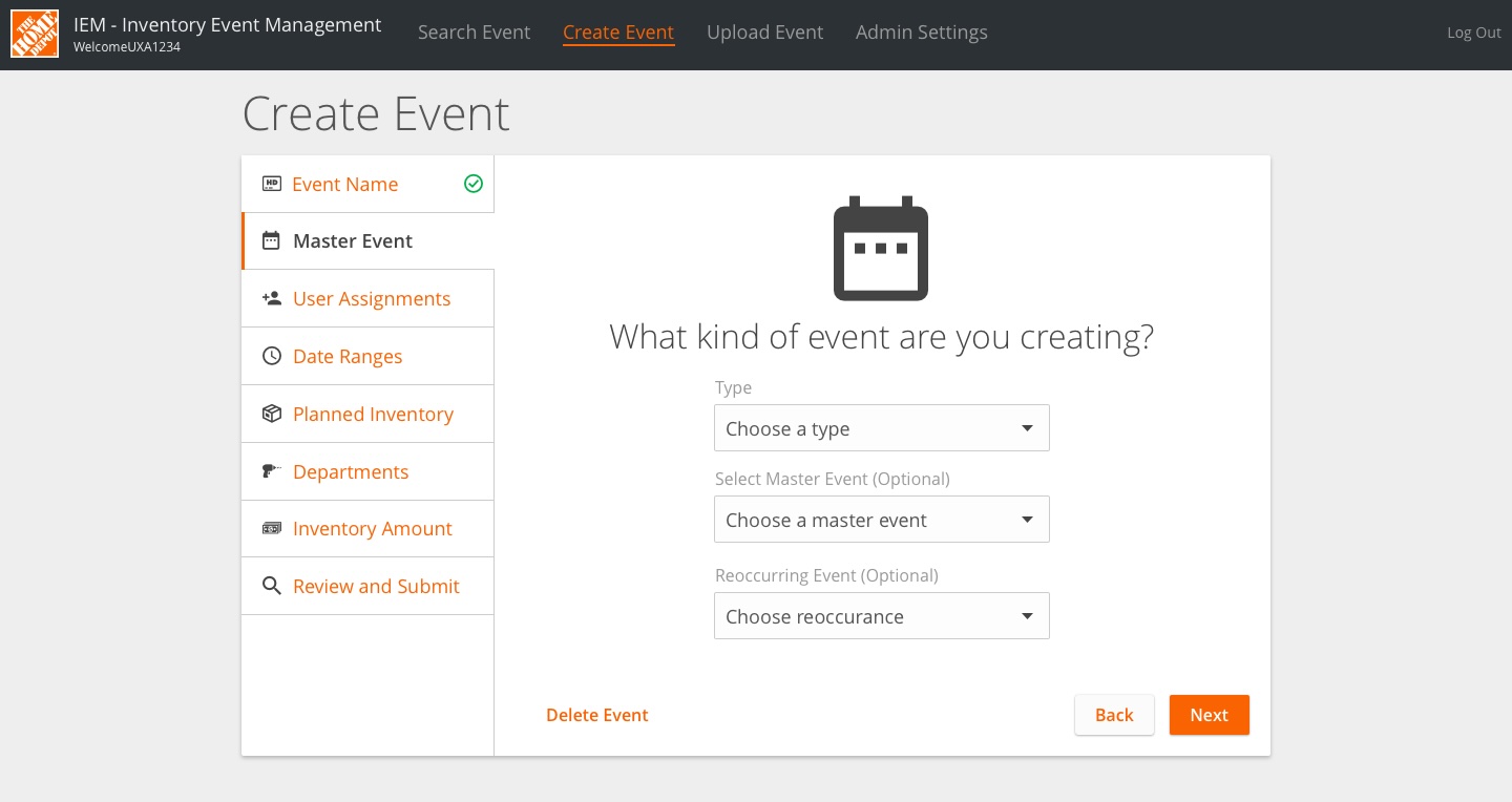
While the product was being finalized, I did get to start designing the Create Event process but as stated above, I didn’t stay long enough to see that feature implemented, either. We pushed for a wizard approach which really resonated with the users and allowed for a lot of flexibility in the steps possible and making sure all of the needs of the Event were addressed.
Final Thoughts
This project’s process was probably the closest to perfect that we could have asked for. We had ample time for research and user testing and we were able to iterate several times during the build process to make sure we covered every requirement that the business and the users has requested. It was an absolute pleasure to work with the Home Depot Enterprise UX Team and I continue to stay in contact with them.